Overview


01

The Challenge

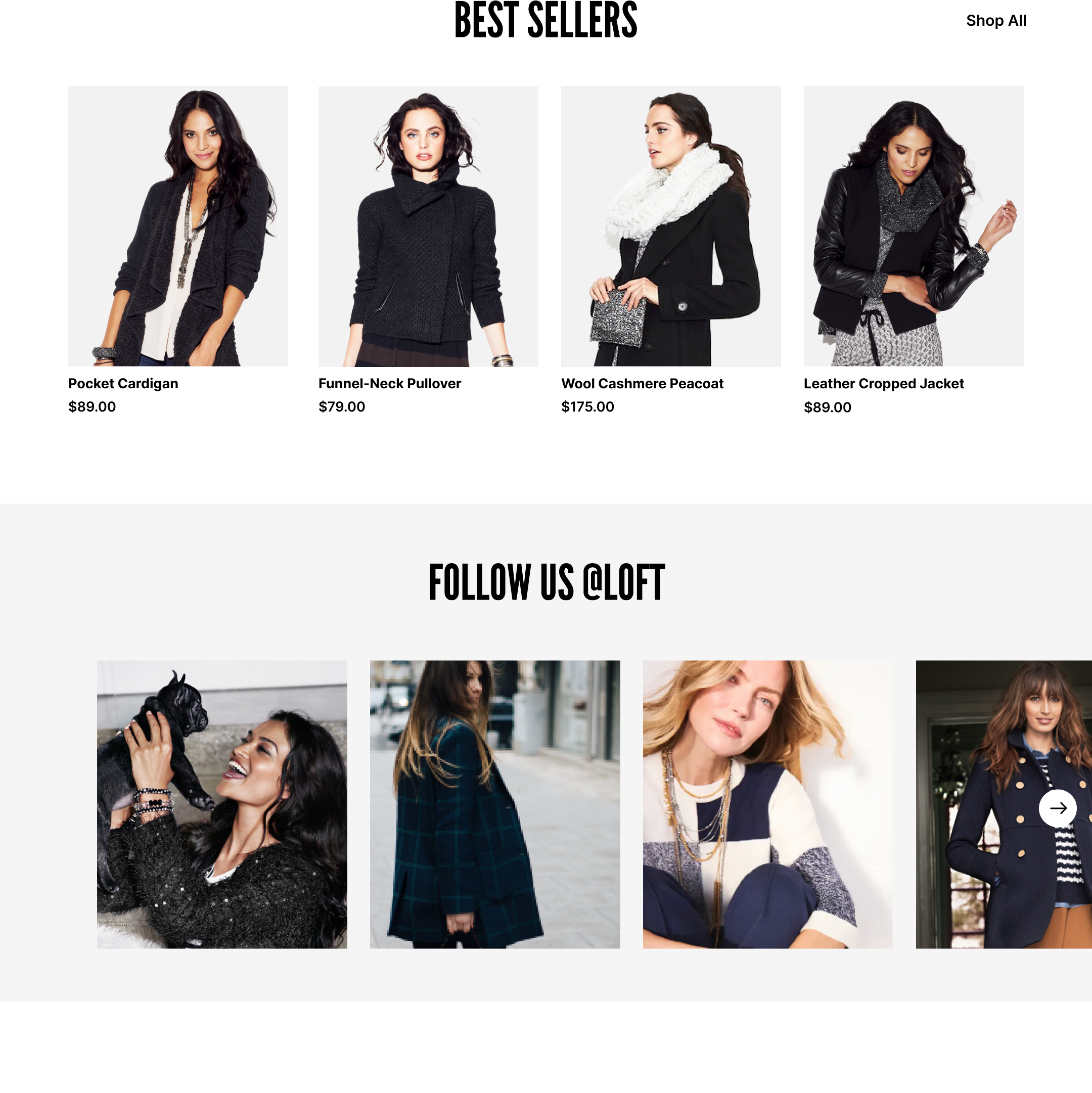
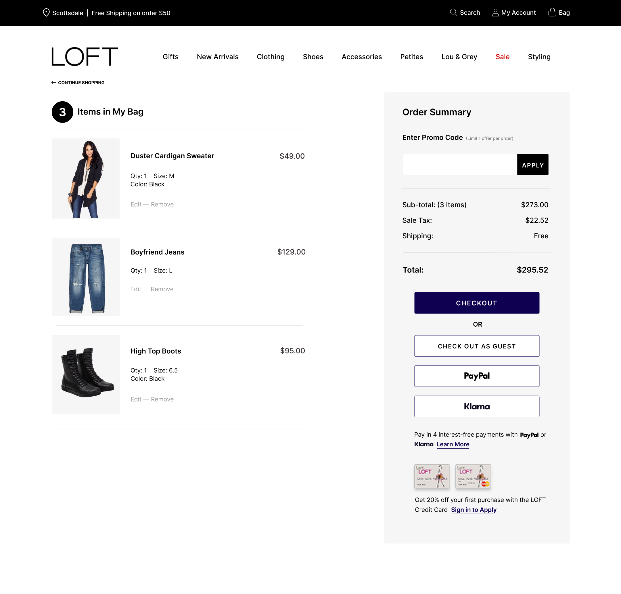
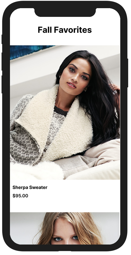
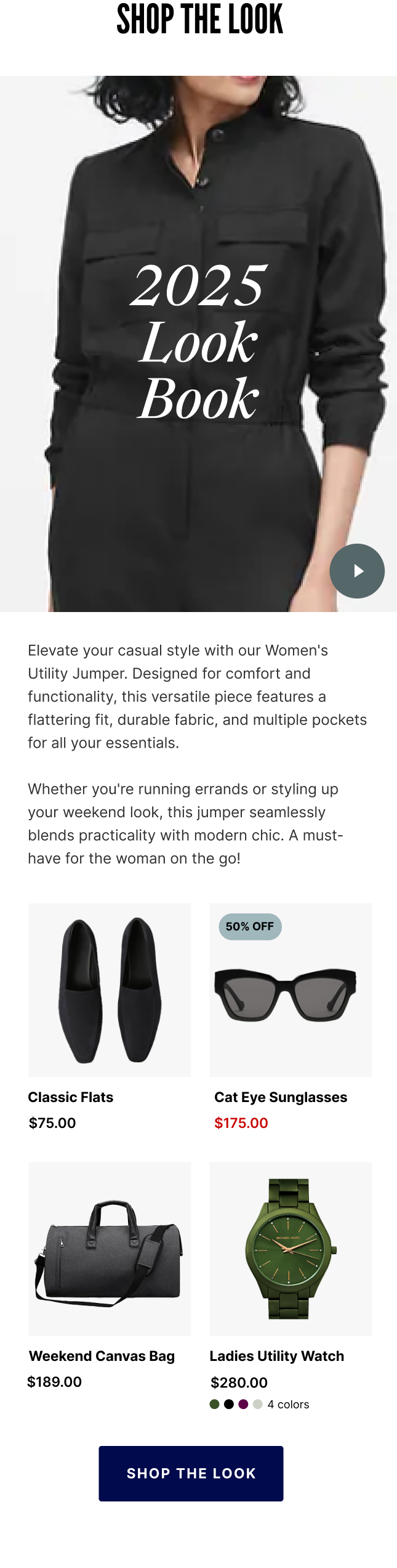
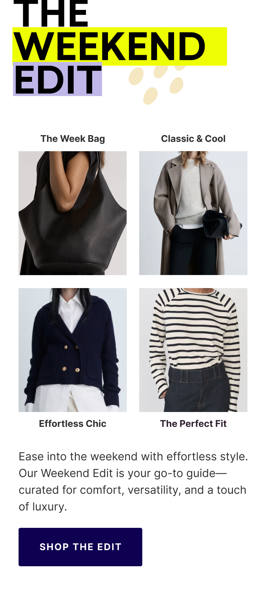
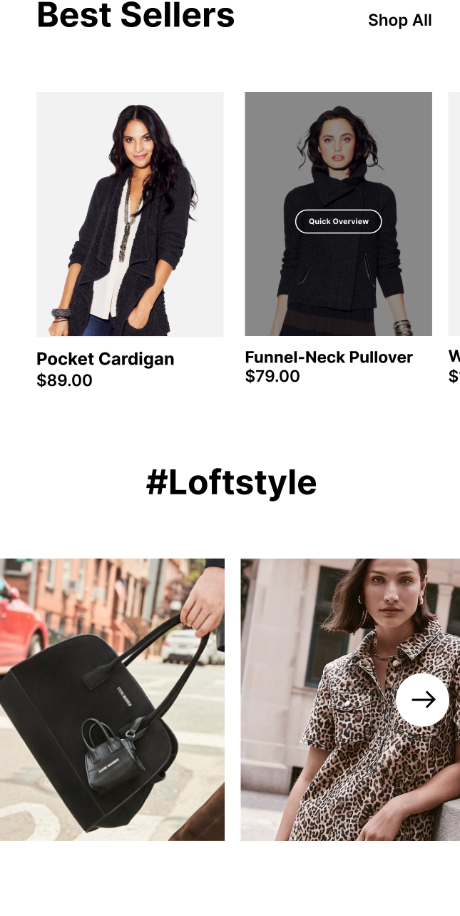
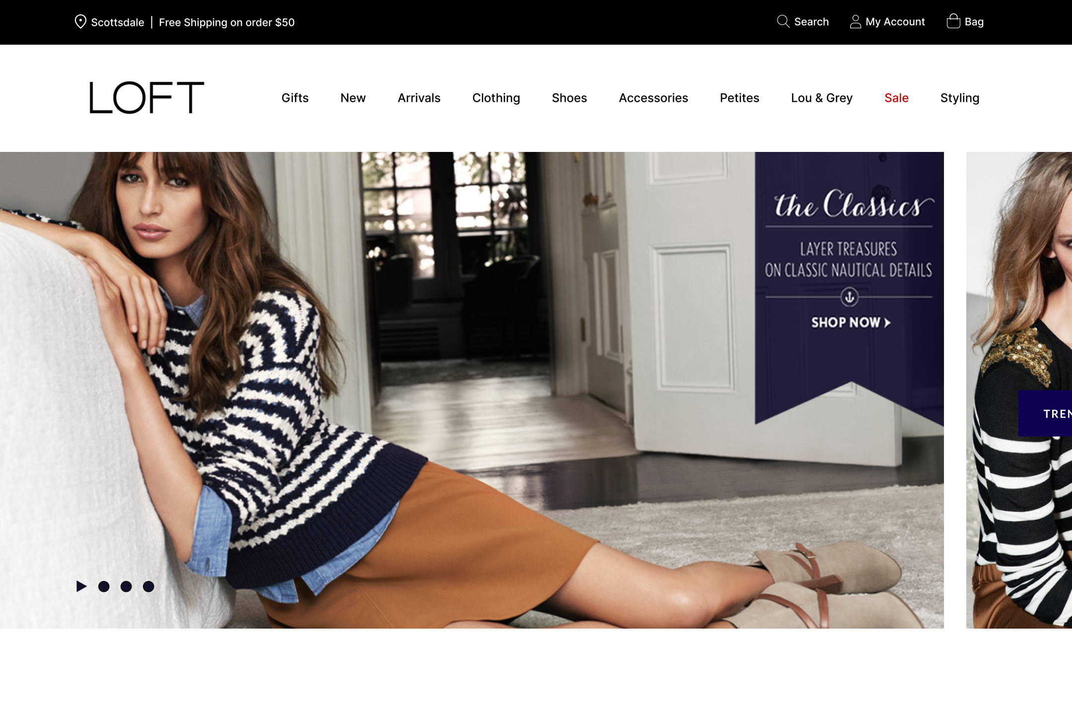
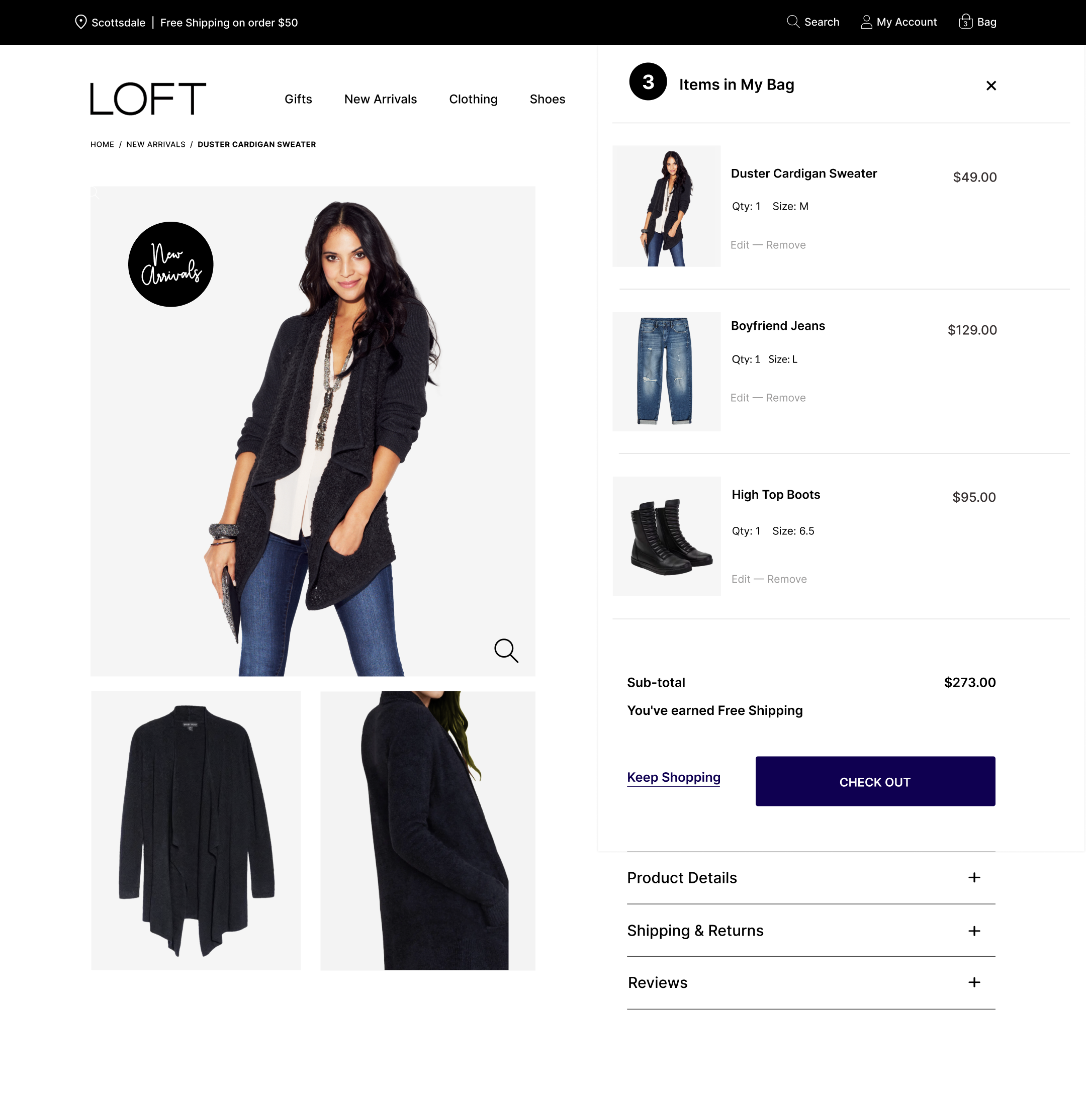
The platform was burdened by a legacy architecture untouched for over a decade. Core usability issues severely crippled conversion metrics: critical elements like the primary checkout call-to-action sat below the fold on mobile screens, key navigation paths were invisible or buried, and conversion funnels suffered from illegible low-contrast typography and script fonts. Additionally, the system lacked a responsive codebase to dynamically serve mobile, tablet, and desktop shoppers.


02

Strategy & Requirements

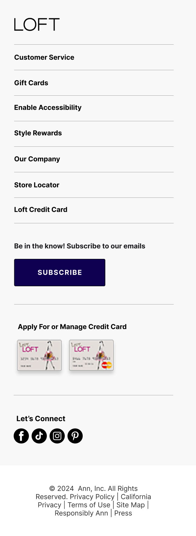
Our objective was to execute an aggressive, high-stakes overhaul ahead of the high-traffic Q4 holiday season. The strategic layout updates focused on four distinct pillars:
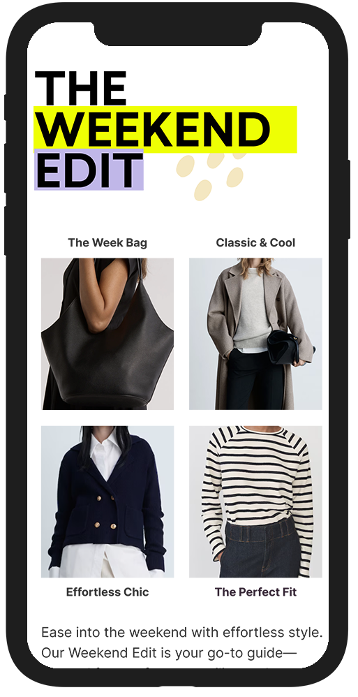
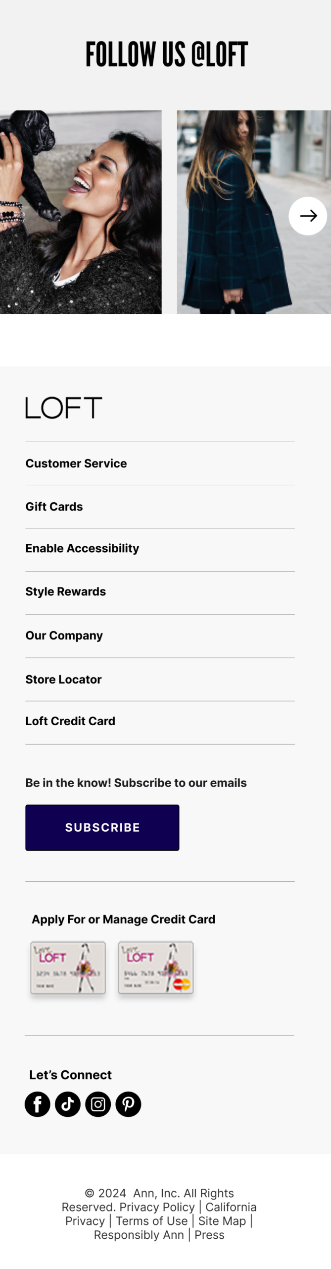
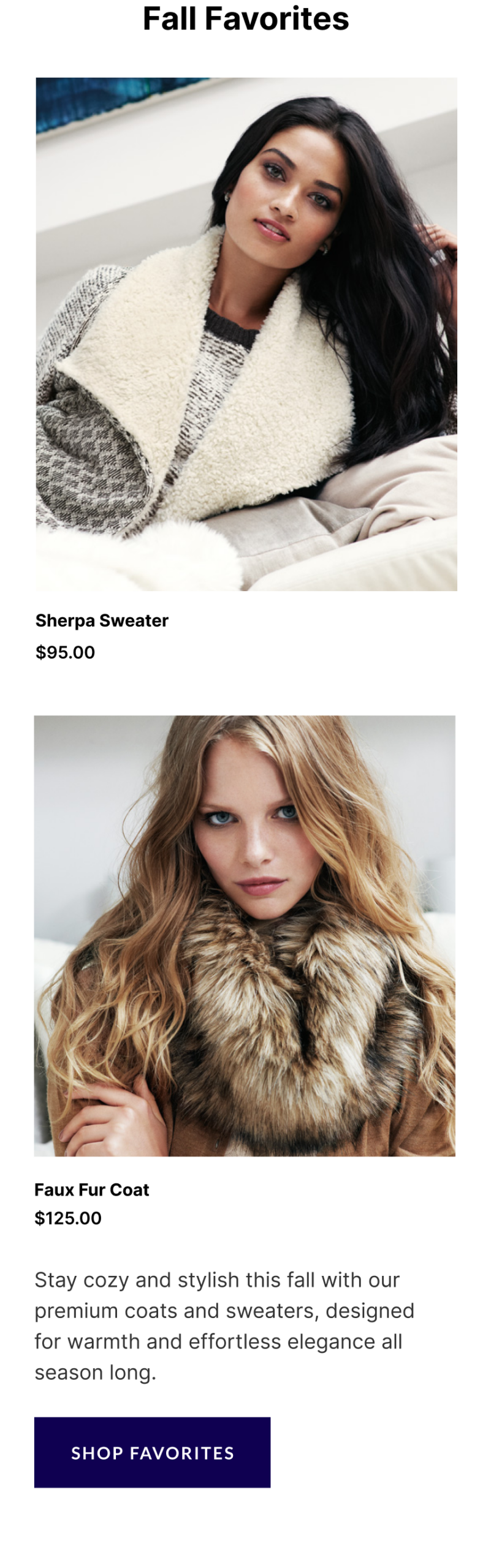
  • Device-Specific Responsiveness: Engineering unified, responsive breakpoints to fluidly scale layouts across desktop, tablet, and mobile screens.
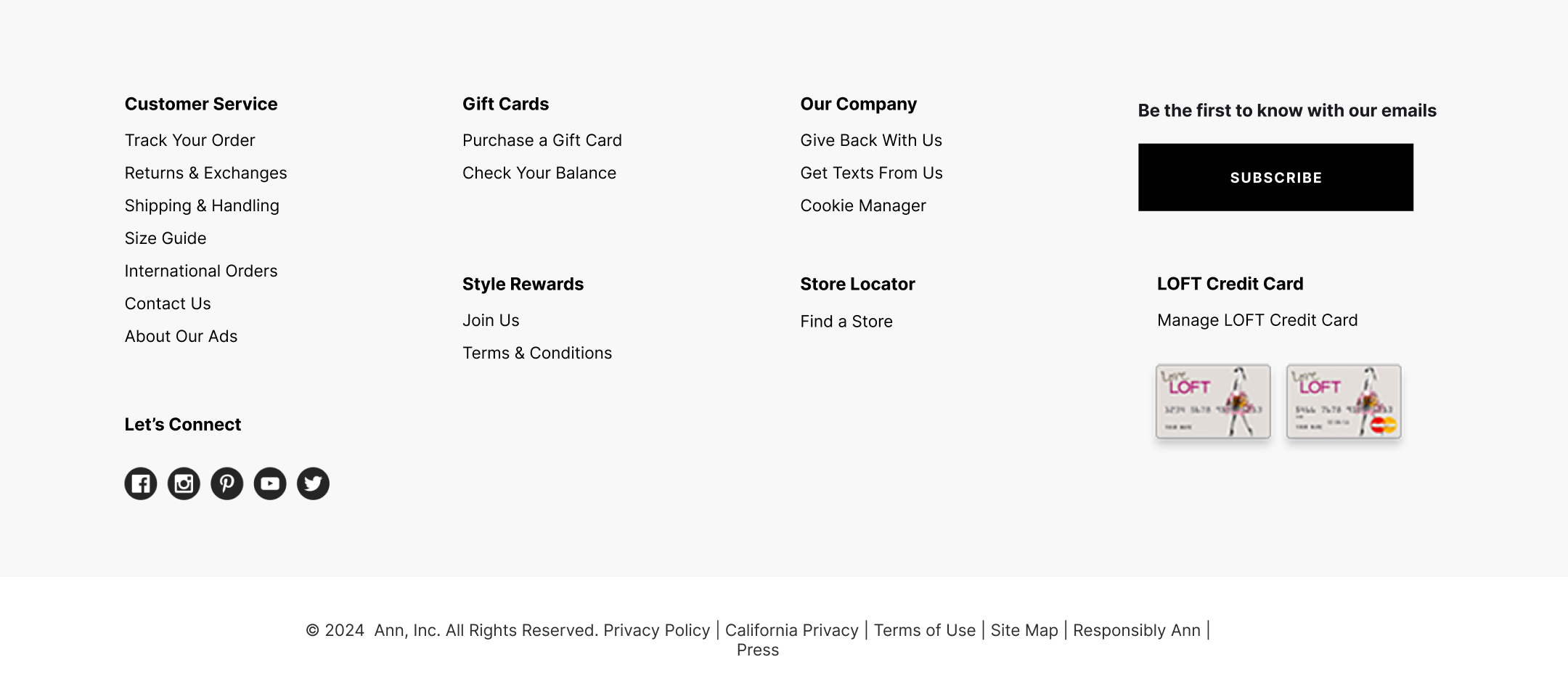
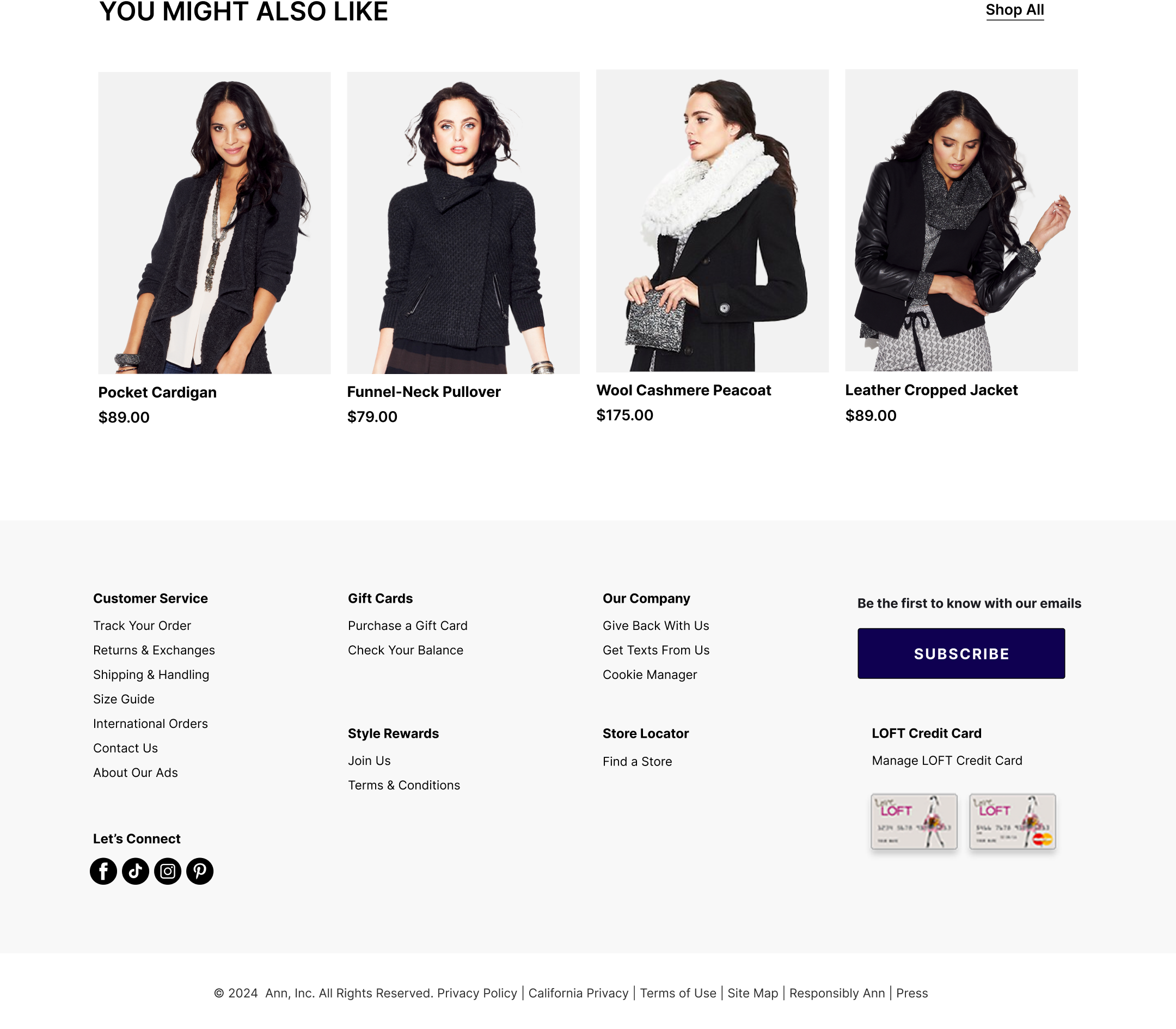
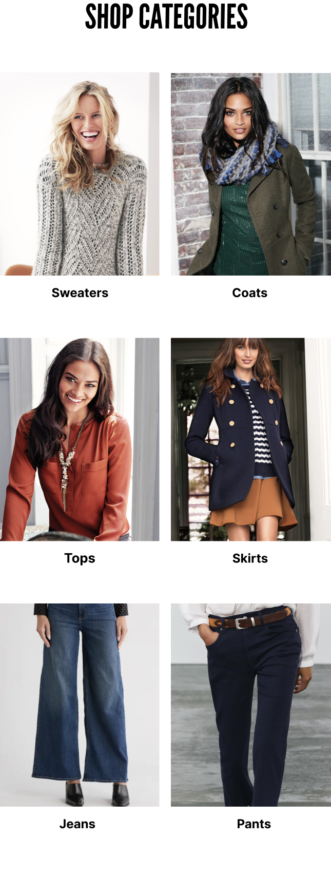
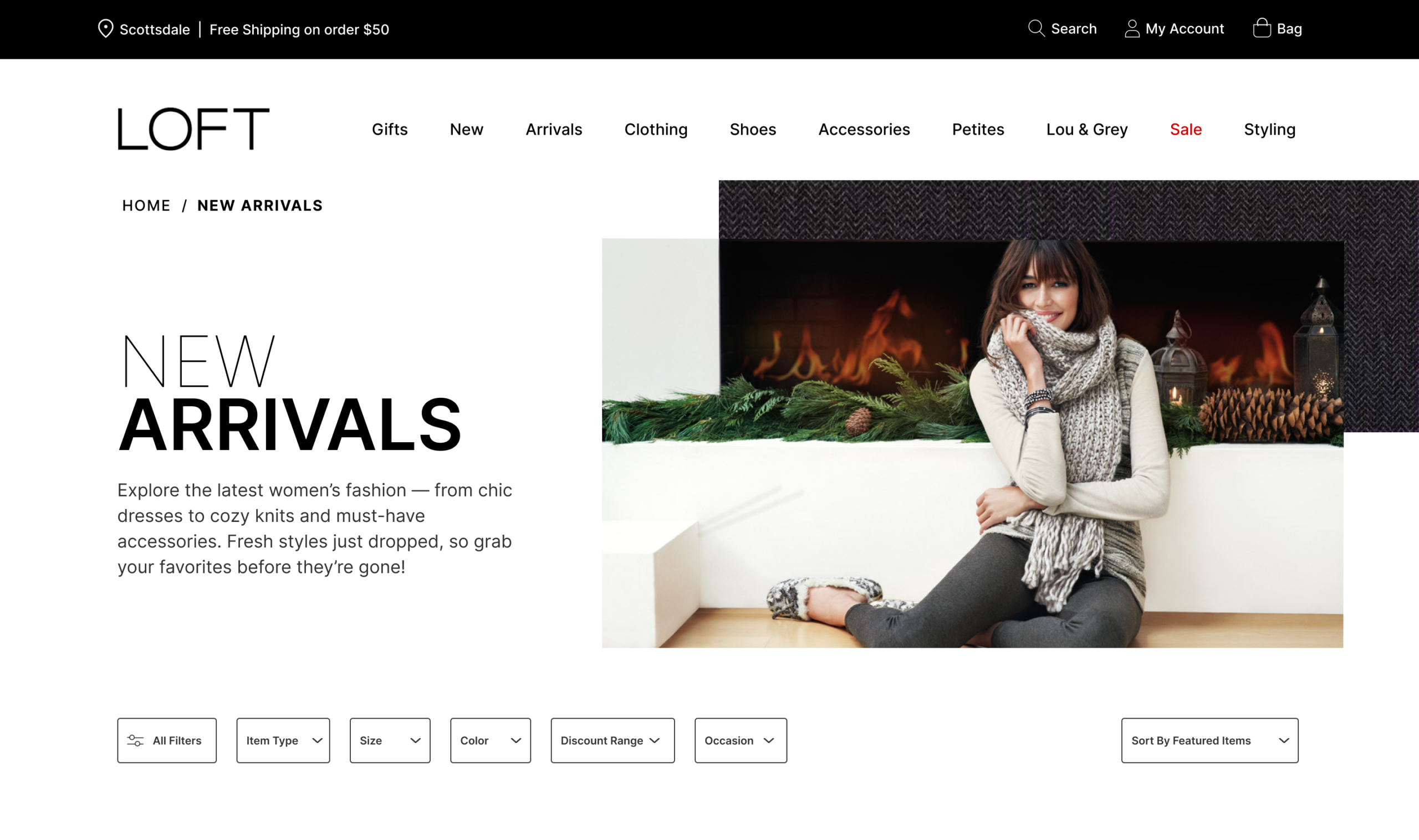
  • Navigational Visibility: Introducing an intuitive primary hierarchy and persistent left navigation structures to streamline product discovery.
  • Legibility Optimization: Overhauling font pairings and color contrast rules to eliminate gray text within primary checkout and conversion funnels.
  • System Scalability: Proactively mapping user journeys and screen flows to accommodate a complex, multi-brand shared cart system slated for future deployment.


03

Process

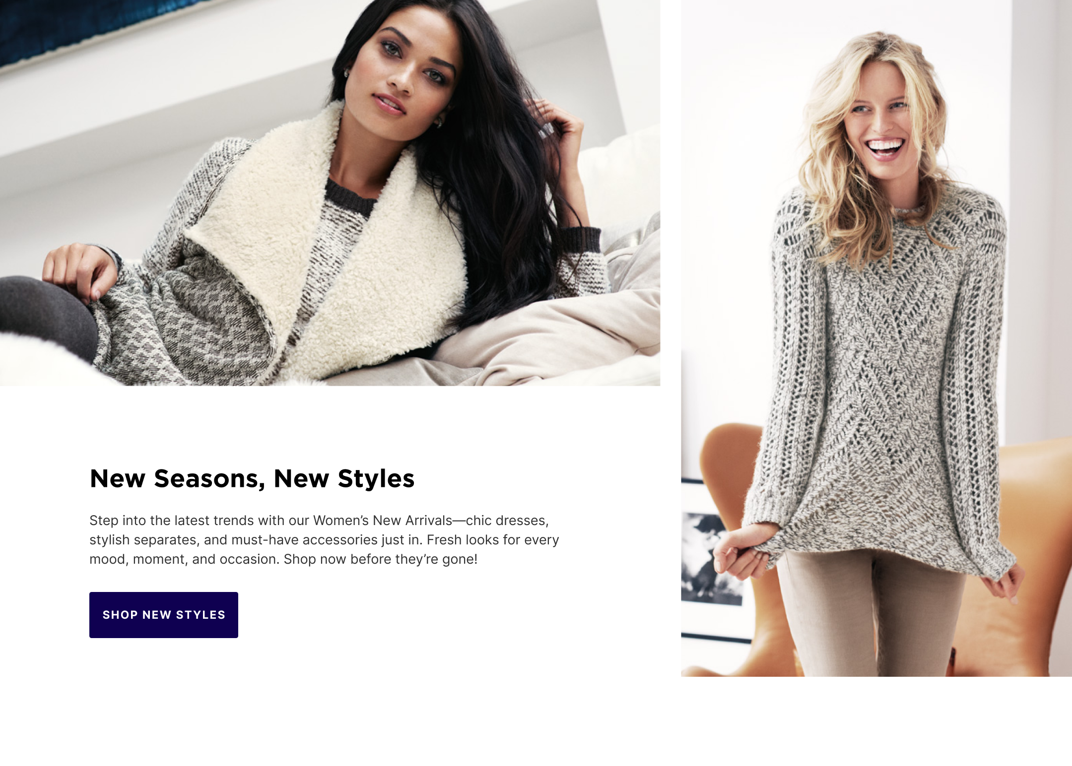
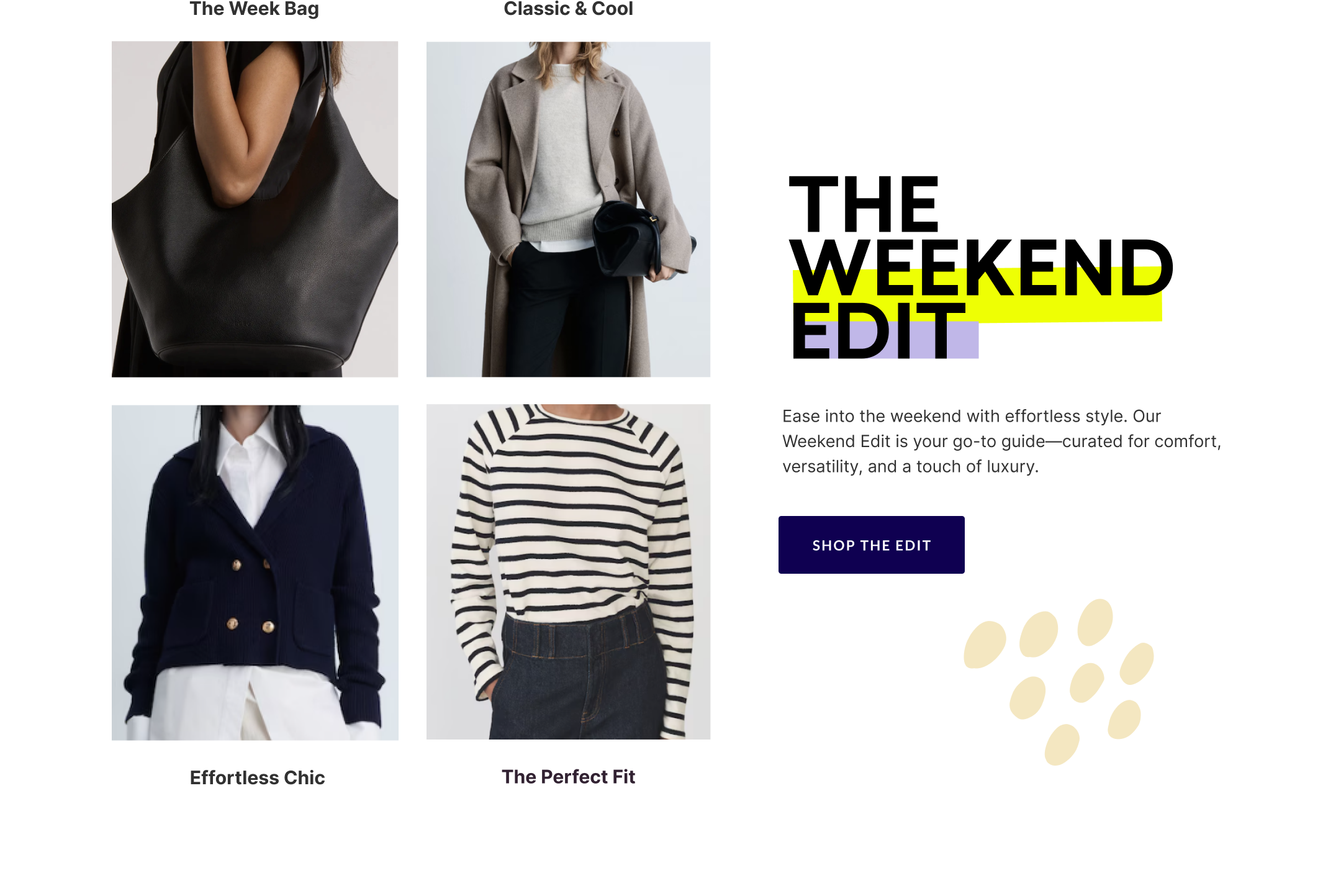
By prioritizing high-impact usability updates first, the responsive design system successfully launched mid-August, positioning the brand to capture maximum traffic during the peak holiday shopping season. The redesign successfully modernised the digital storefront, creating an accessible, intuitive cross-platform ecosystem optimized for long-term multi-brand scalability.


04

Impact &Launch

By prioritizing high-impact usability updates first, the responsive design system successfully launched mid-August, positioning the brand to capture maximum traffic during the peak holiday shopping season. The redesign successfully modernised the digital storefront, creating an accessible, intuitive cross-platform ecosystem optimized for long-term multi-brand scalability.

Colors & Typography

Conversion-Focused Accessibility

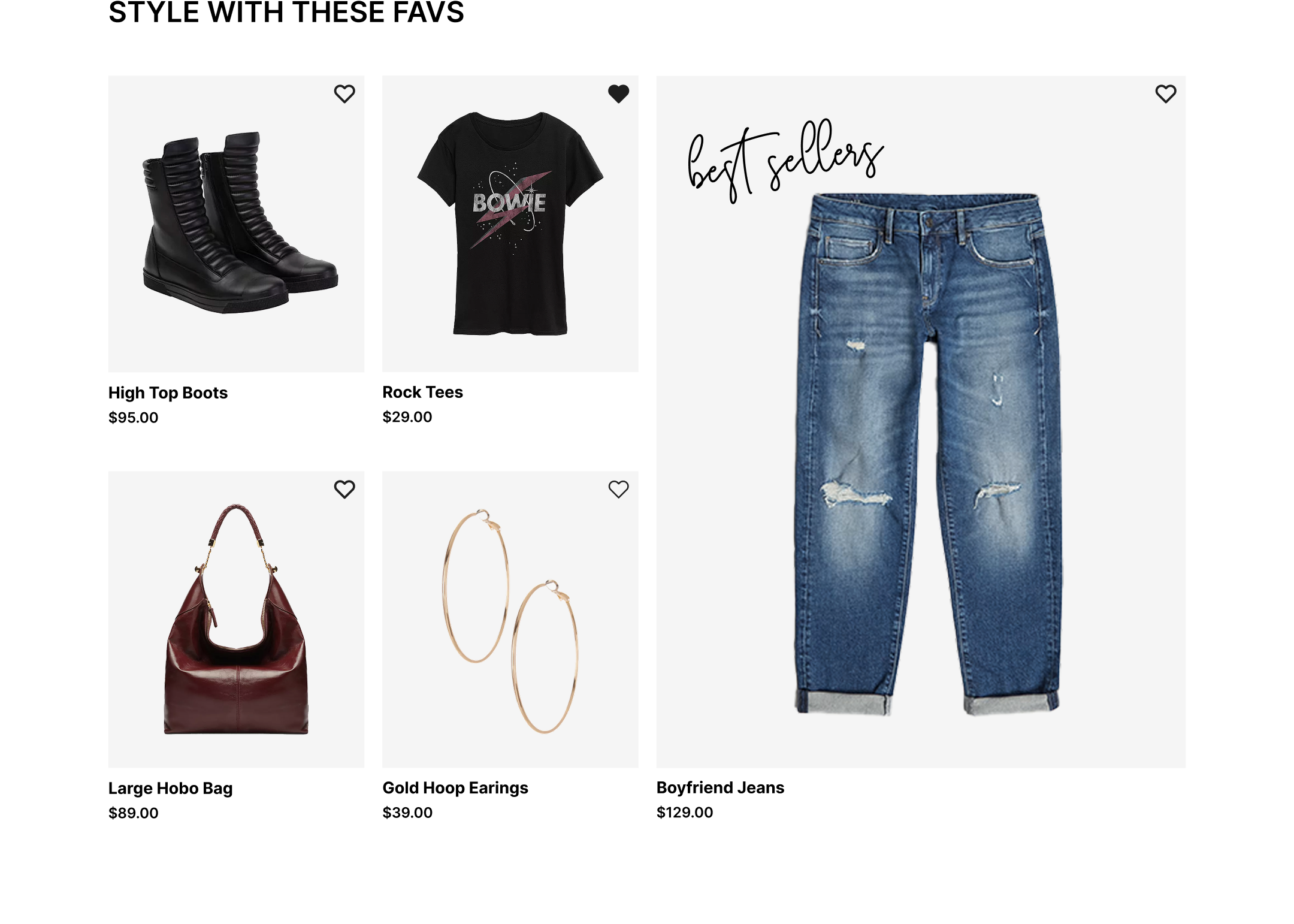
We upgraded font weights and optimized color contrasts to ensure pricing, sizes, and field labels are instantly readable across all devices.

The Visual Identity

Deep navy and sleek black create a sophisticated foundation, while soft pink and elegant grey-blue tones add a fresh, modern contrast.

#272D59
R39, G45, B89
C56, M49, Y0, K65

#943068
R148, G48 B104
C0, M68, Y30, K42

#EF0086
R239, G0, B134
C0, M100, Y44, K6

#586B7E
R160, 183, 188
C15, M3, Y0, K26

#7A9A01
R121, G154, B1
C21, M0, Y99, K40

#000000
R000, G000, B000
C0 M0 Y0 K100

Headlines

League Gothic

A B C D E F G H I J K L M N O P Q R S T U V W X Y Z 1 2 3 4 5 6 7 8 9 0 A B C D E F G H I J K L M N O P Q R S T U V W X Y Z 1 2 3 4 5 6 7 8 9 0 A B C D E F G H I J K L M N O P Q R S T U V W X Y Z 1 2 3 4 5 6 7 8 9 0

Paragraphs

Inter

Lorem Ipsum is simply dummy text of the printing and typesetting industry. Lorem Ipsum has been the industry's standard dummy text ever since the 1500s.

Desktop UI Layouts

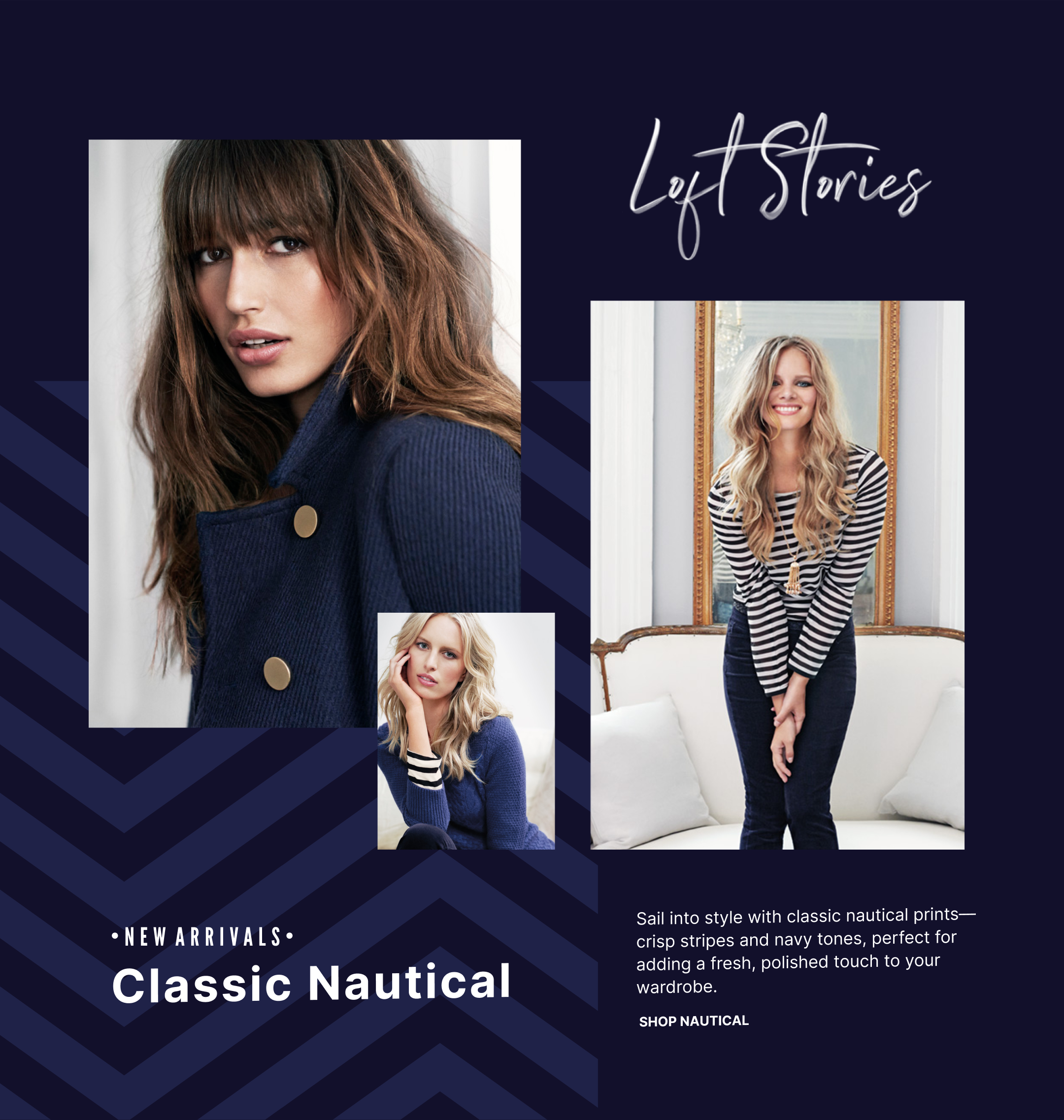
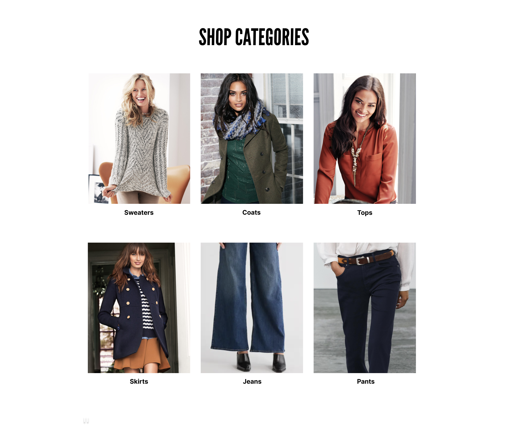
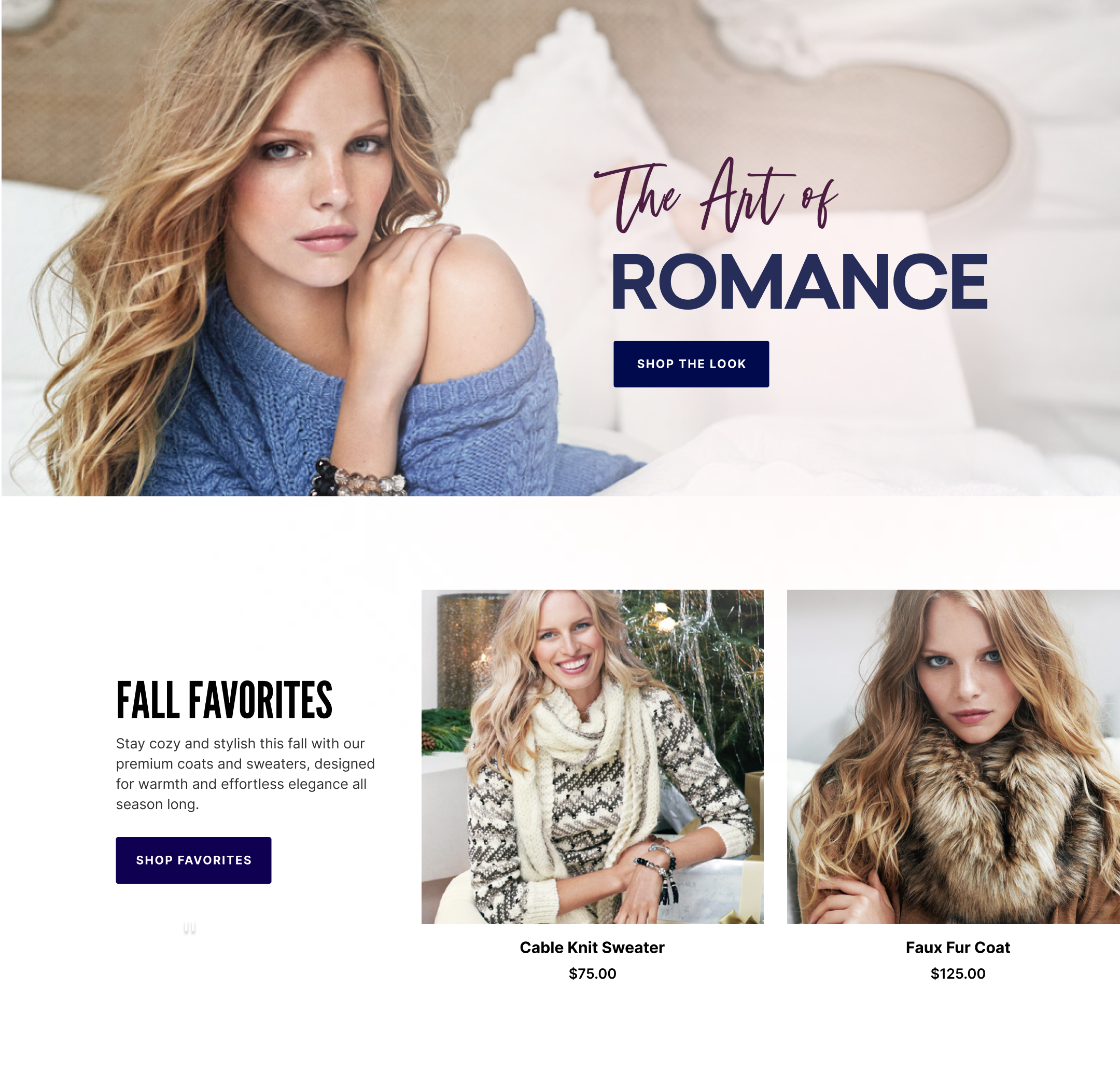
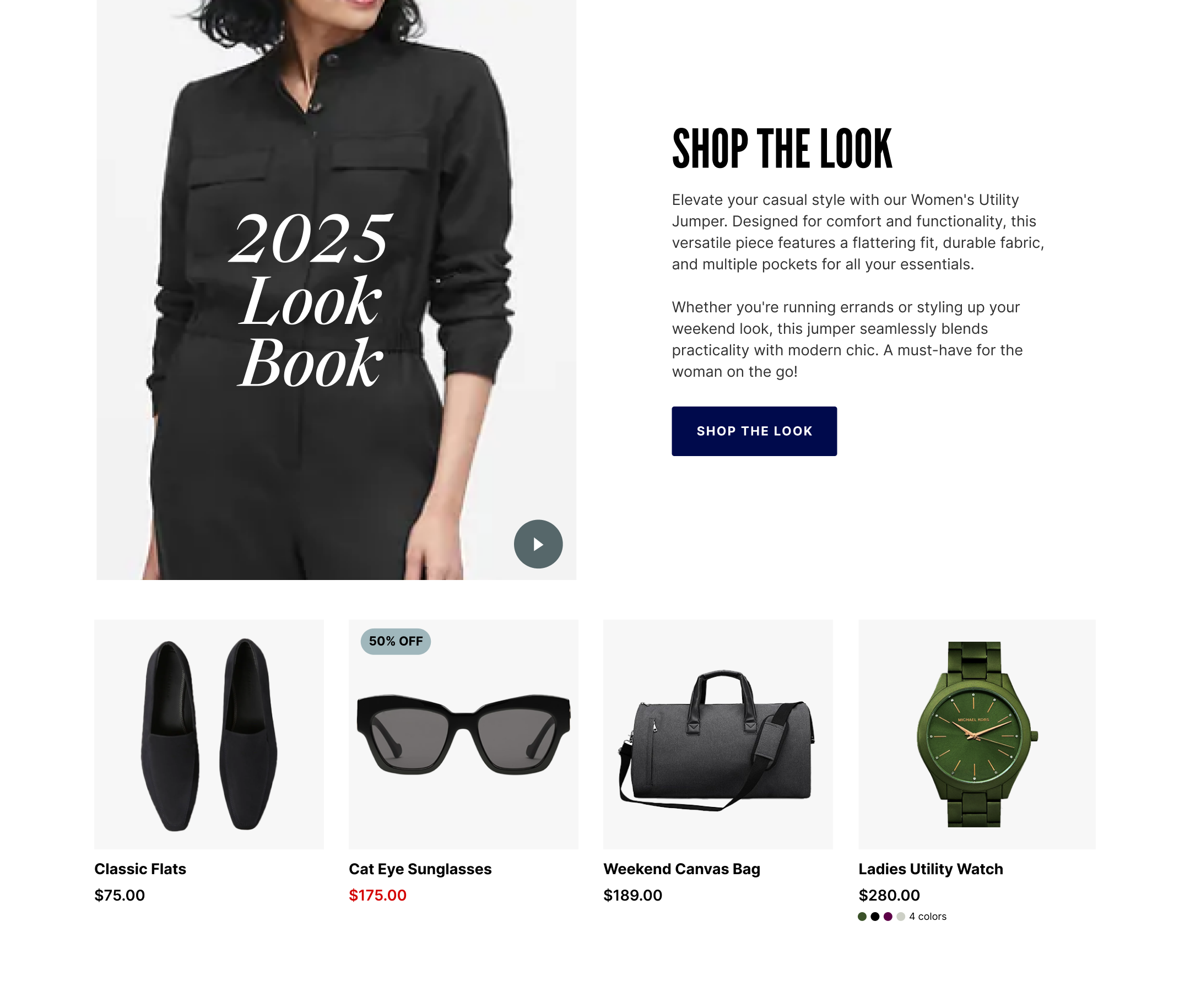
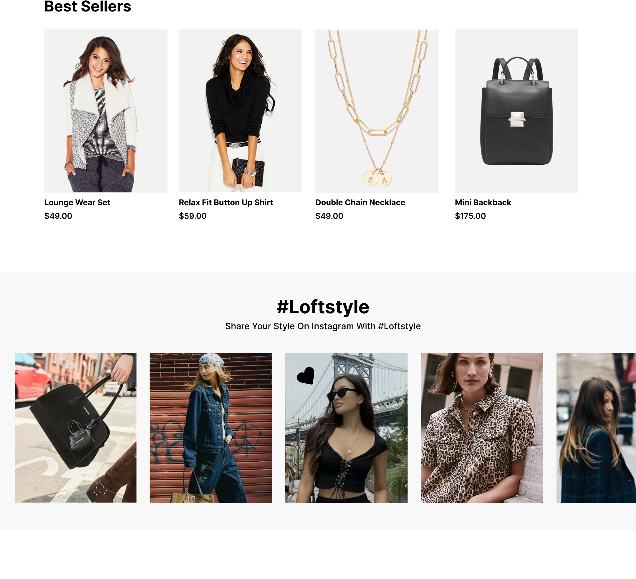
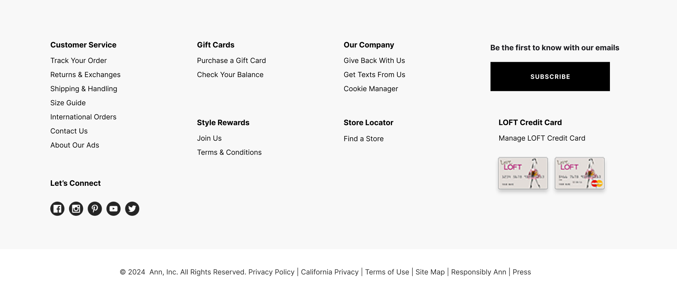
Home Page Concept 1
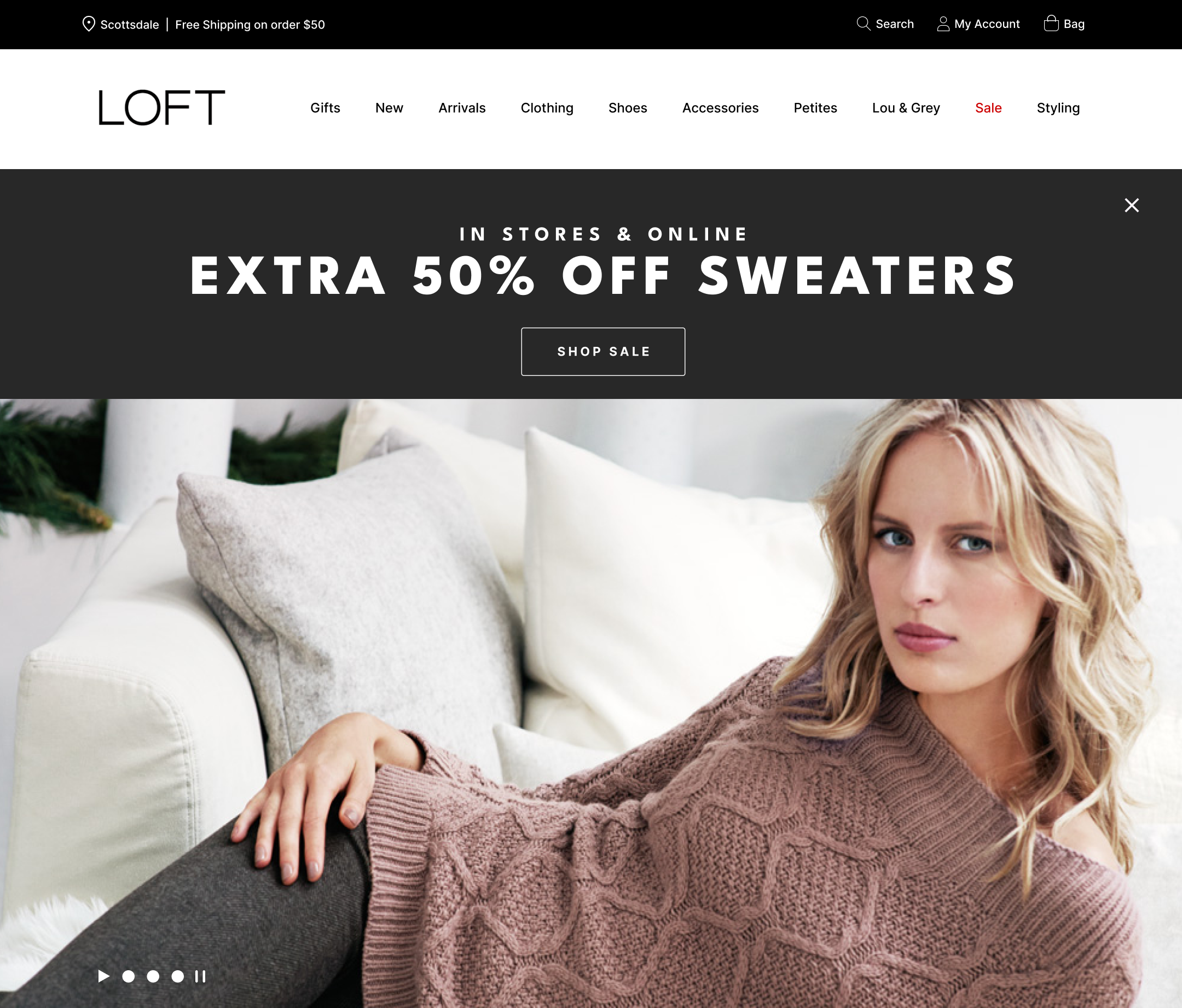
Home Page Concept 2
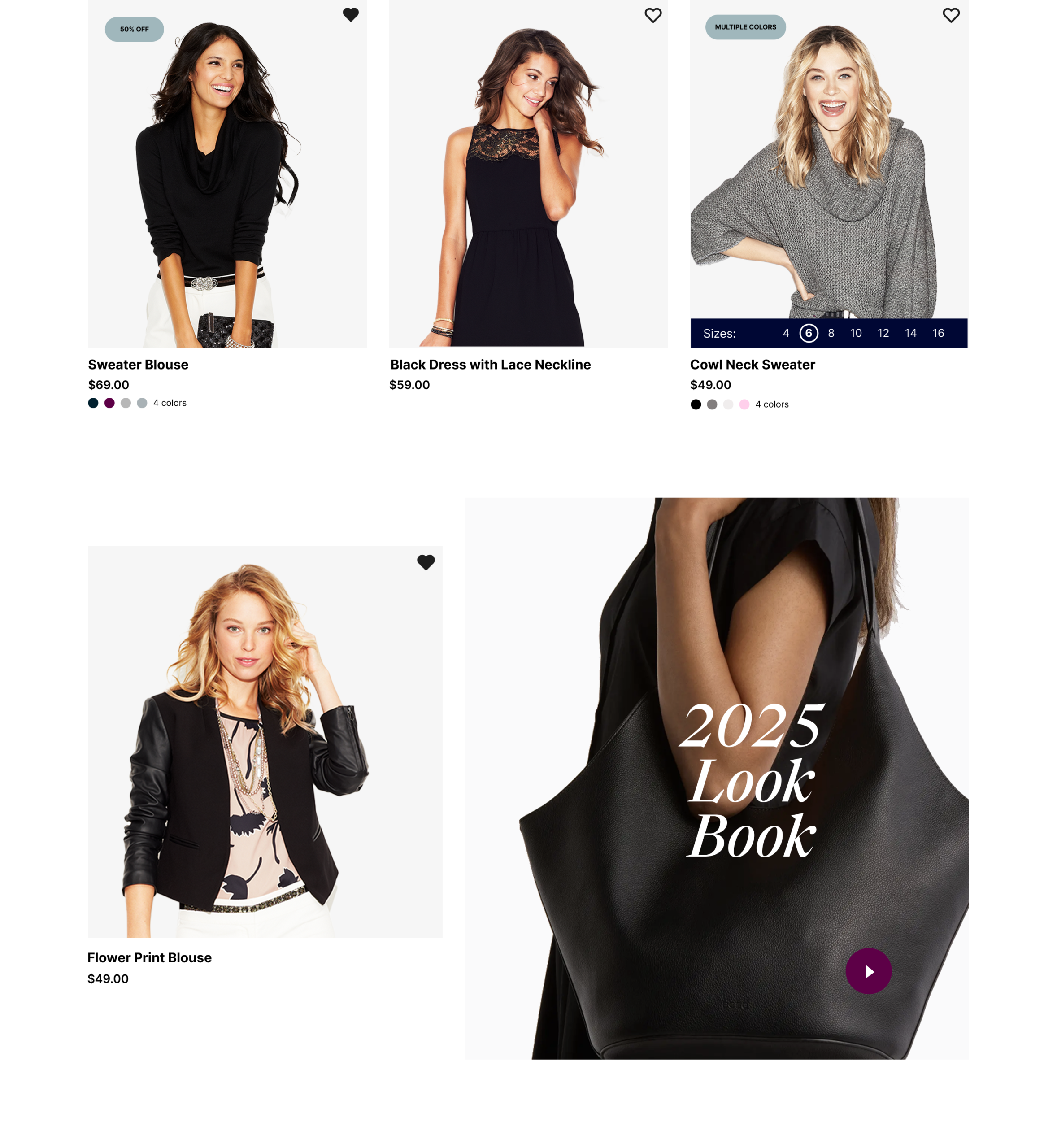
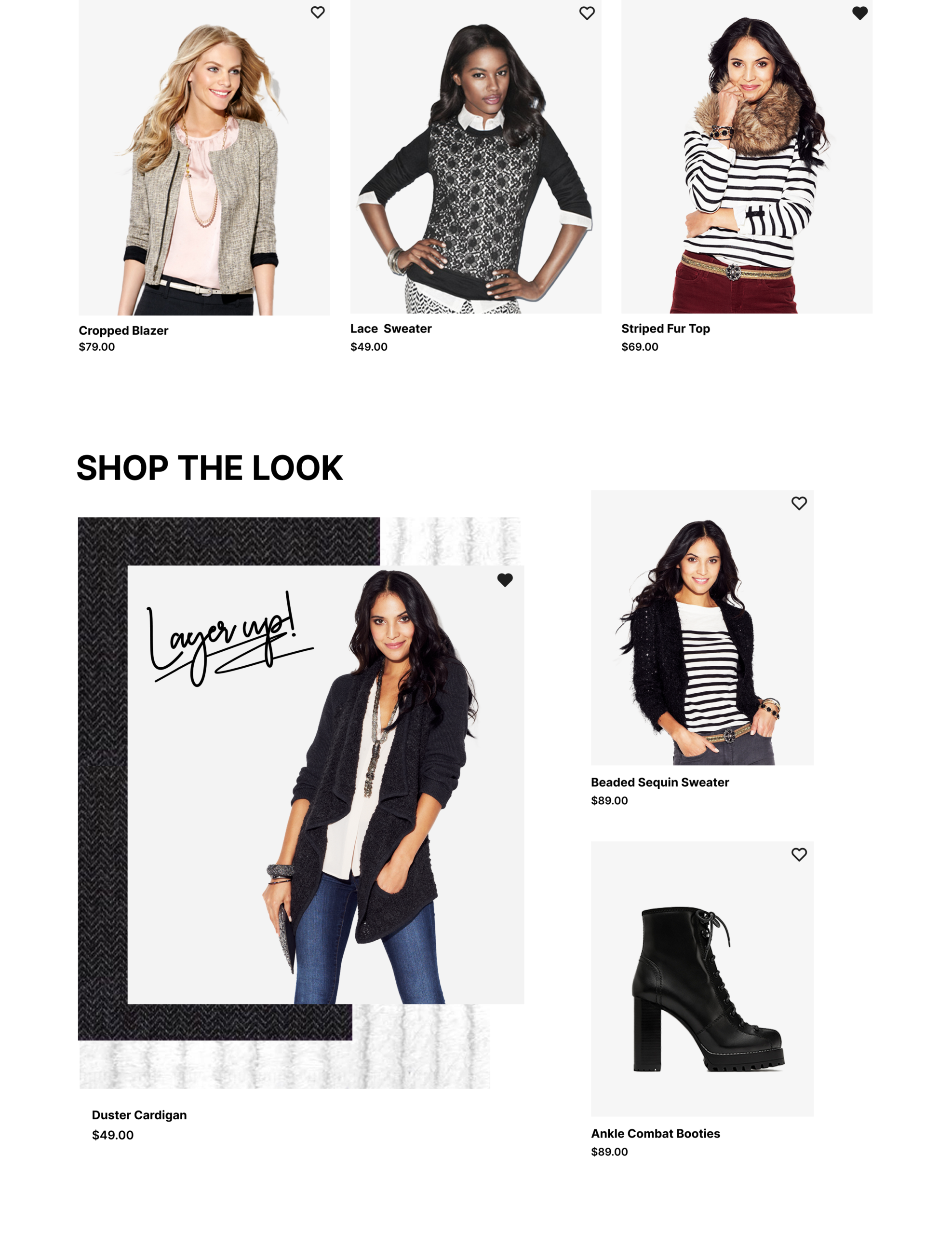
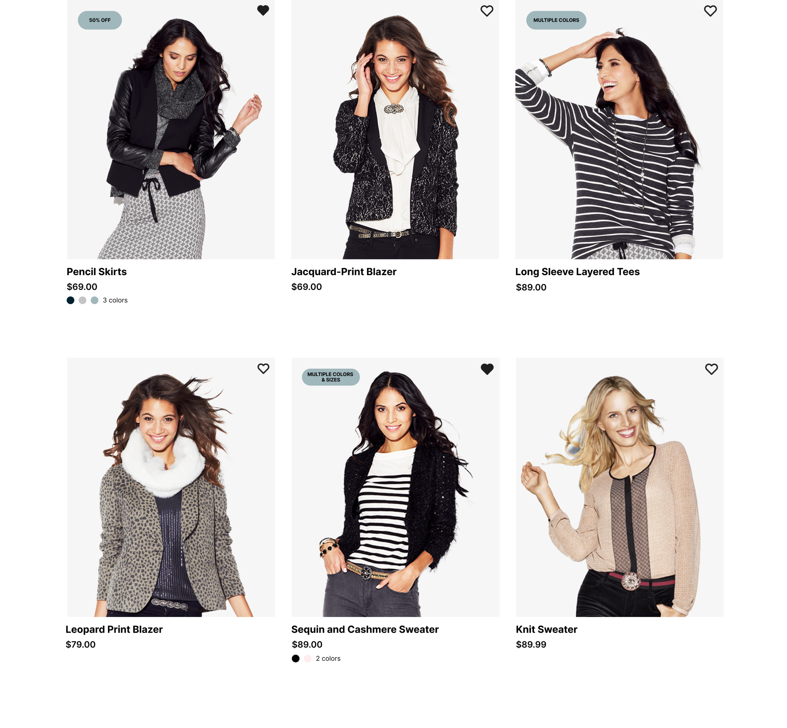
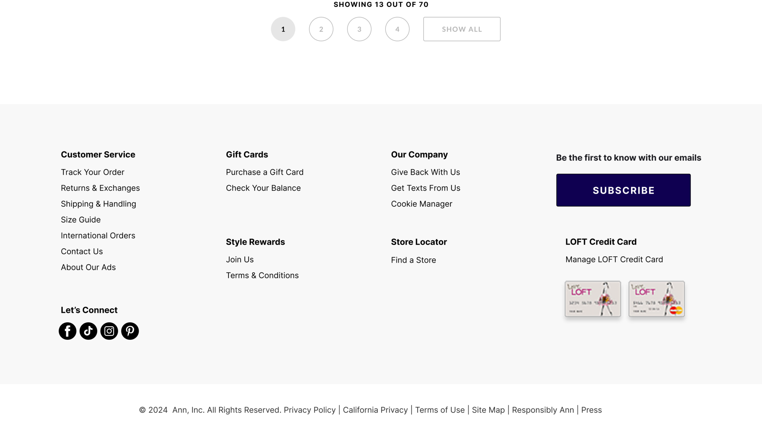
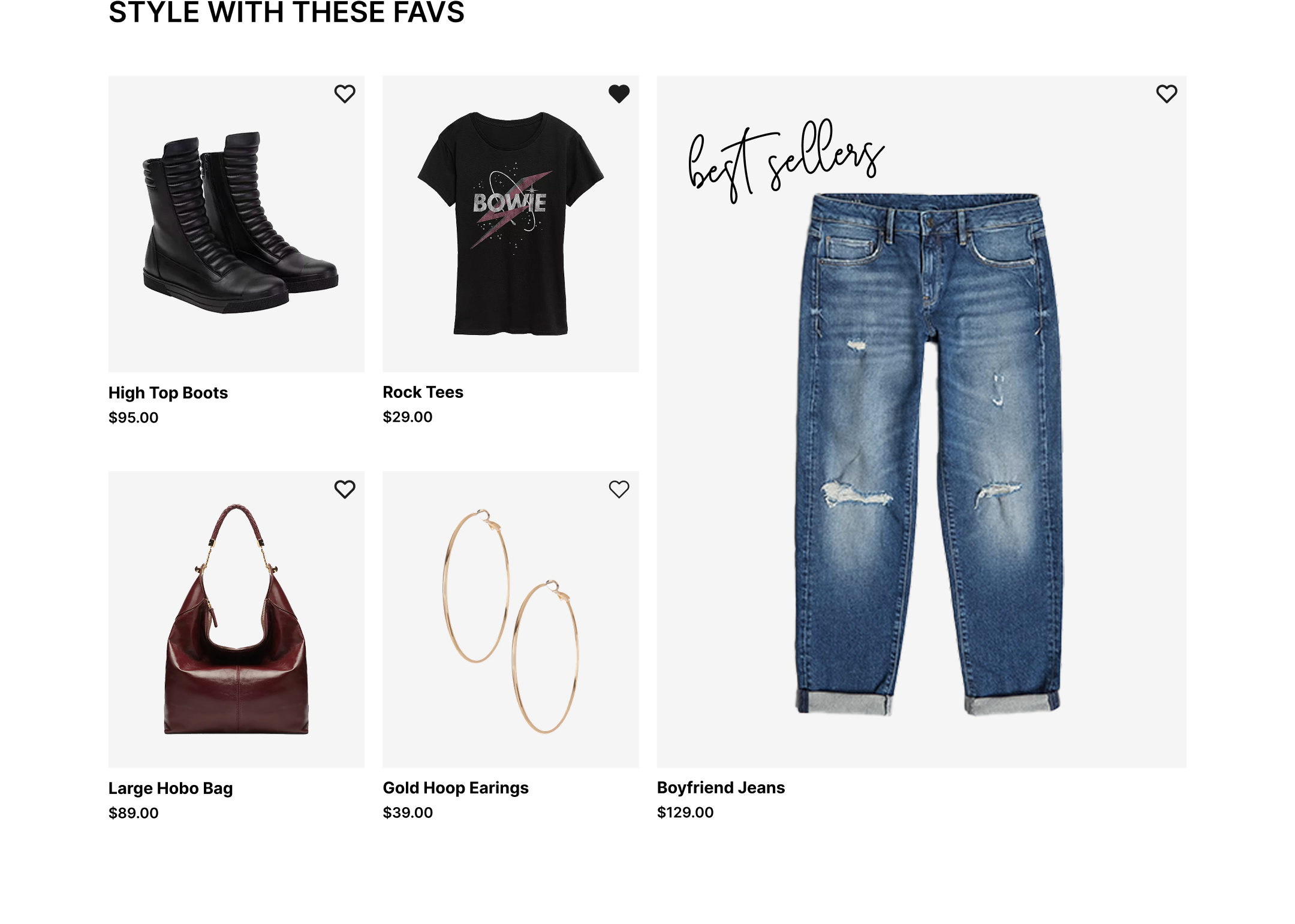
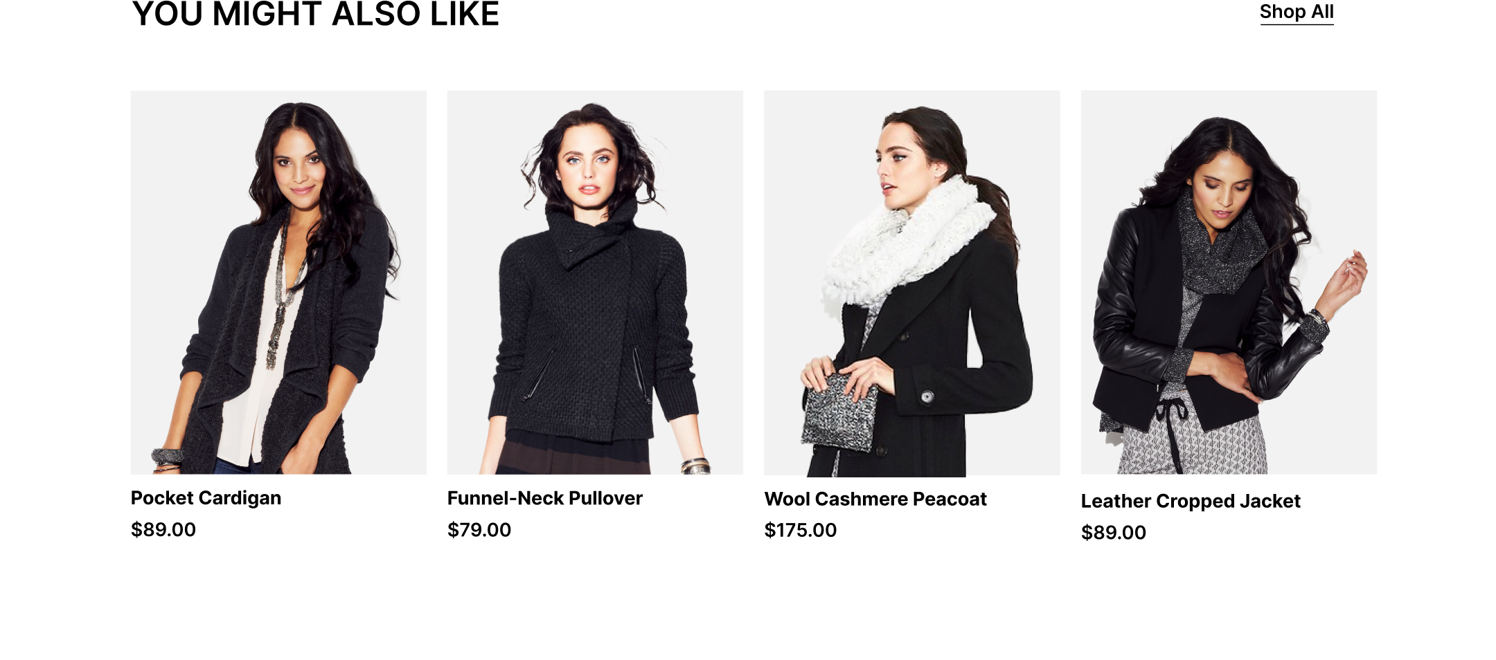
Product Listing Page
Checkout
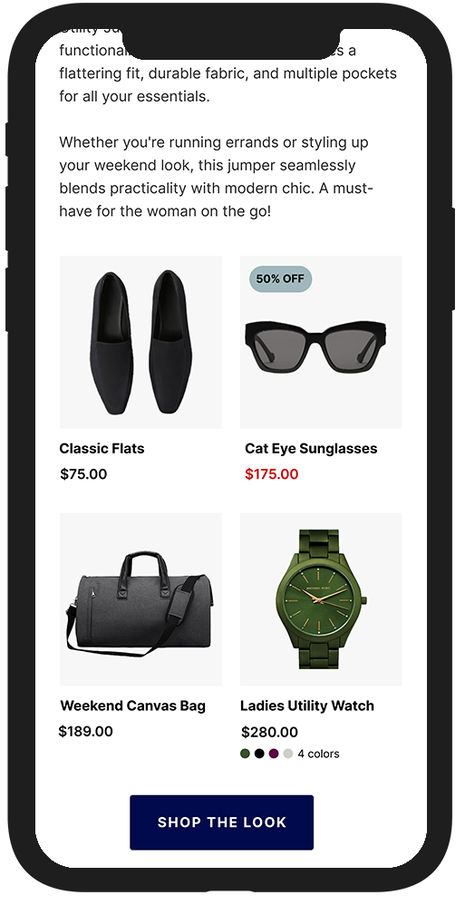
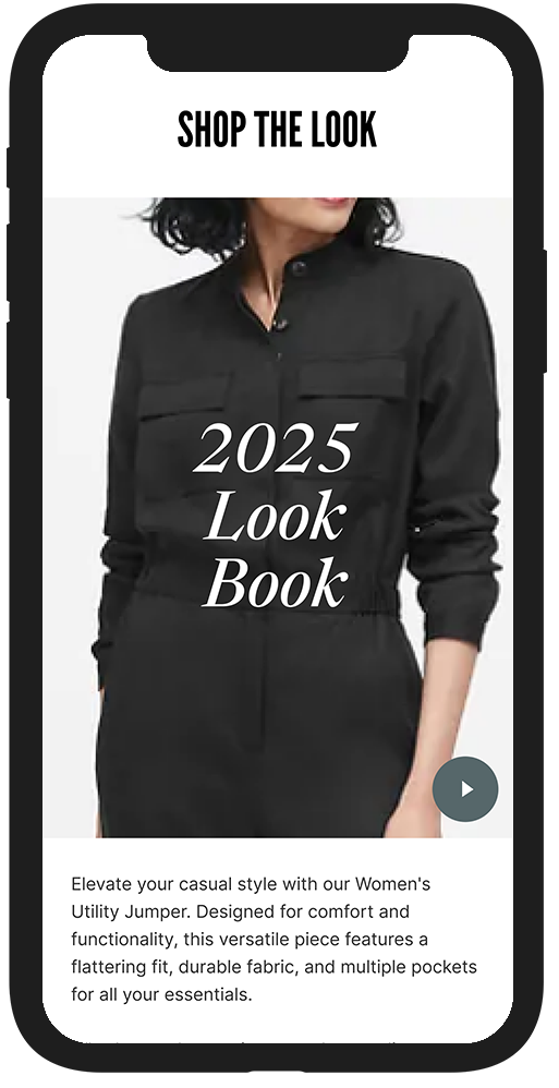
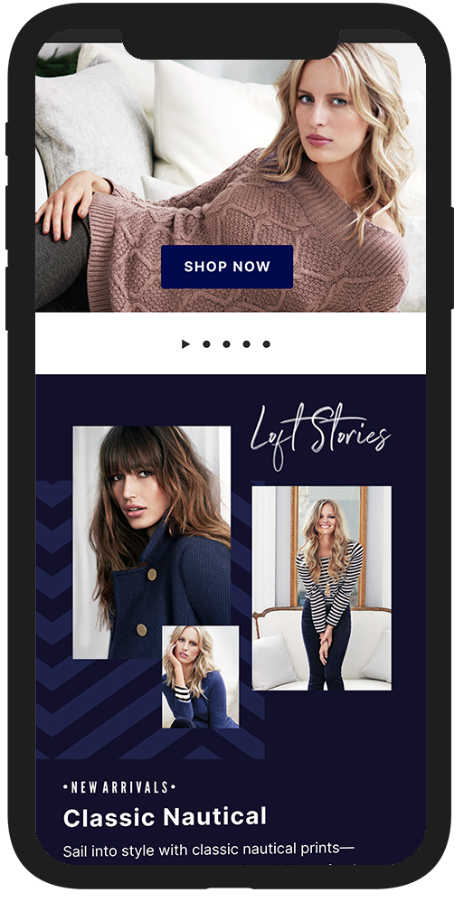
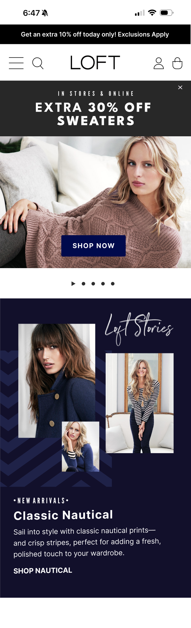
Mobile Components
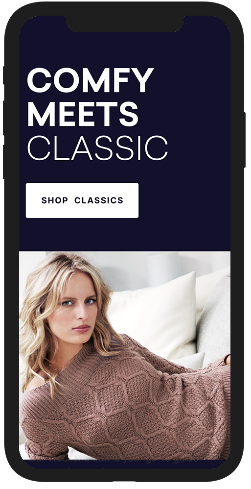

Mobile Layouts


View More Work