Overview
01
Problem
The previous site’s design was feeling outdated and difficult to navigate, the focus shifted to creating fresh visual concepts and playful, trend-driven layouts that captured the energy and style of a modern teen audience, resulting in a more engaging and user-friendly shopping experience.
02
Goal
The goal of the redesigned e-commerce website was to create a seamless and intuitive shopping experience that increased user engagement, improved conversion rates, and optimized mobile functionality. By enhancing site navigation and streamlining the checkout process, the site aimed to drive boost overall sales.
03
Process
Brought in to assist the design team with the redesign after user research and initial planning were completed. The role focused on close collaboration with the design team to develop fresh, creative concepts for the microsite—introducing new layouts, and visual directions that aligned with project goals and enhanced the overall user experience.
04
Results
The redesigned website led to a smoother, more intuitive user experience, with an increase in page engagement and a reduction in bounce rates. Mobile responsiveness improvements resulted in a higher conversion rates on mobile devices. Overall, the project contributed to a increase in sales and improved customer feedback on site usability.
Colors & Typography
The microsite layouts were developed by evolving the existing color palette into a fresher, more modern expression of the brand. Through experimentation with balance and contrast, the combination of black, white, pink, neon yellow, and greys was refined to enhance visual energy and appeal to a teen audience.
The result is a vibrant, playful aesthetic that strengthens brand recognition while maintaining cohesion across all digital touchpoints.
#EC0038
R236, G0, B56
C0, M100, Y76, K7
#FF0084
R255, G0, B132
C0, M100, Y48, K0
#FFD800
R255, G216, B0
C0, M15, Y100, K0
#FF5231
R255, G82, B49
C00, M68, Y81, K0
#000000
R000, G000, B000
C0 M0 Y0 K100
#7A9A01
R121, G154, B1
C21, M0, Y99, K40
Headlines:
Inter Bold
A B C D E F G H I J K L M N O P Q R S T U V W X Y Z 1 2 3 4 5 6 7 8 9 0 A B C D E F G H I J K L M N O P Q R S T U V W X Y Z 1 2 3 4 5 6 7 8 9 0 A B C D E F G H I J K L M N O P Q R S T U V W X Y Z 1 2 3 4 5 6 7 8 9 0
Paragraphs:
Inter
Lorem Ipsum is simply dummy text of the printing and typesetting industry. Lorem Ipsum has been the industry's standard dummy text ever since the 1500s.
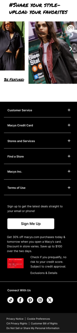
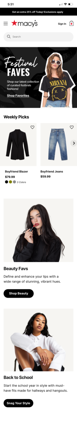
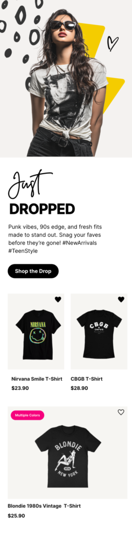
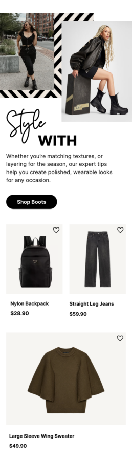
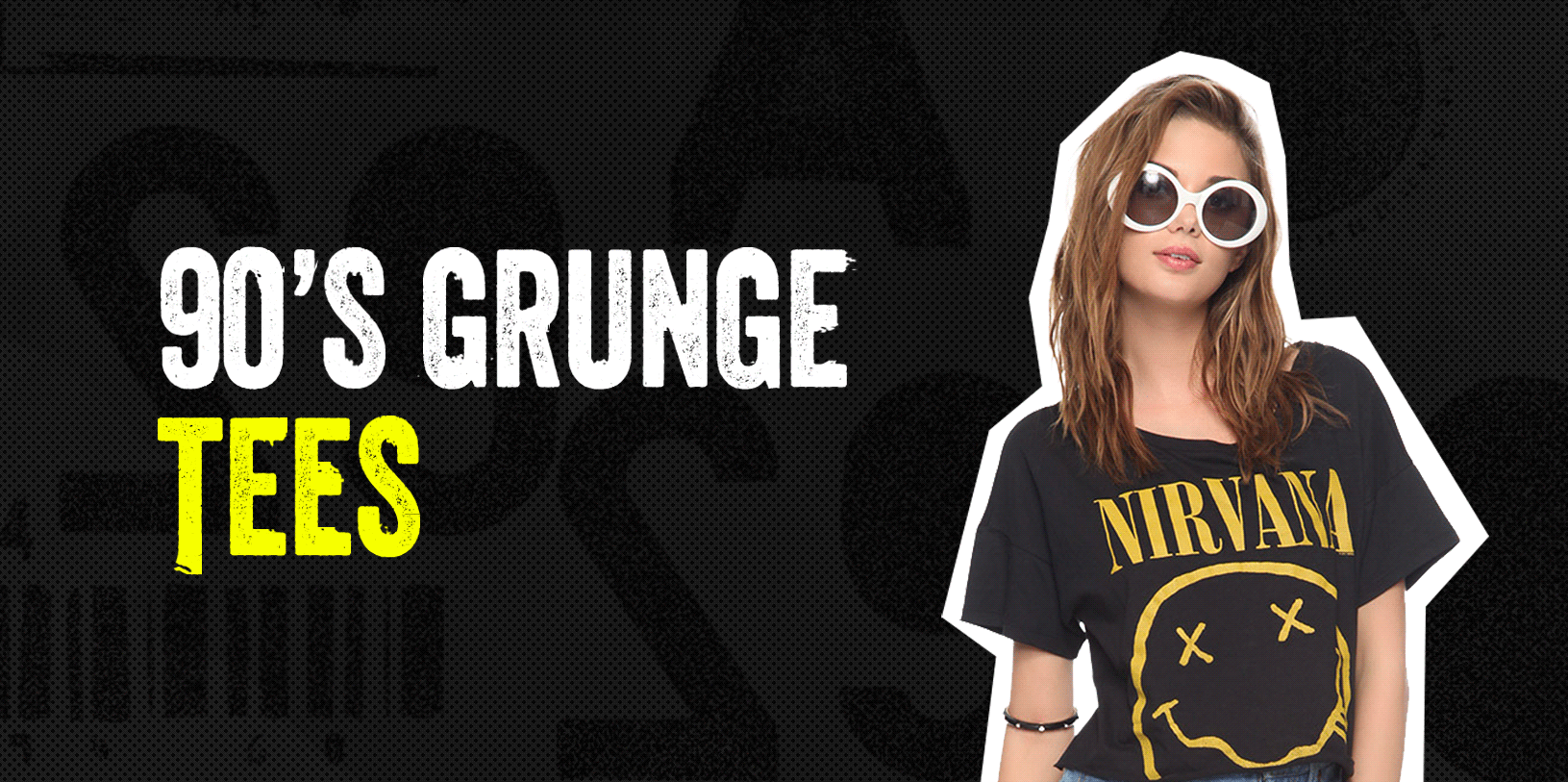
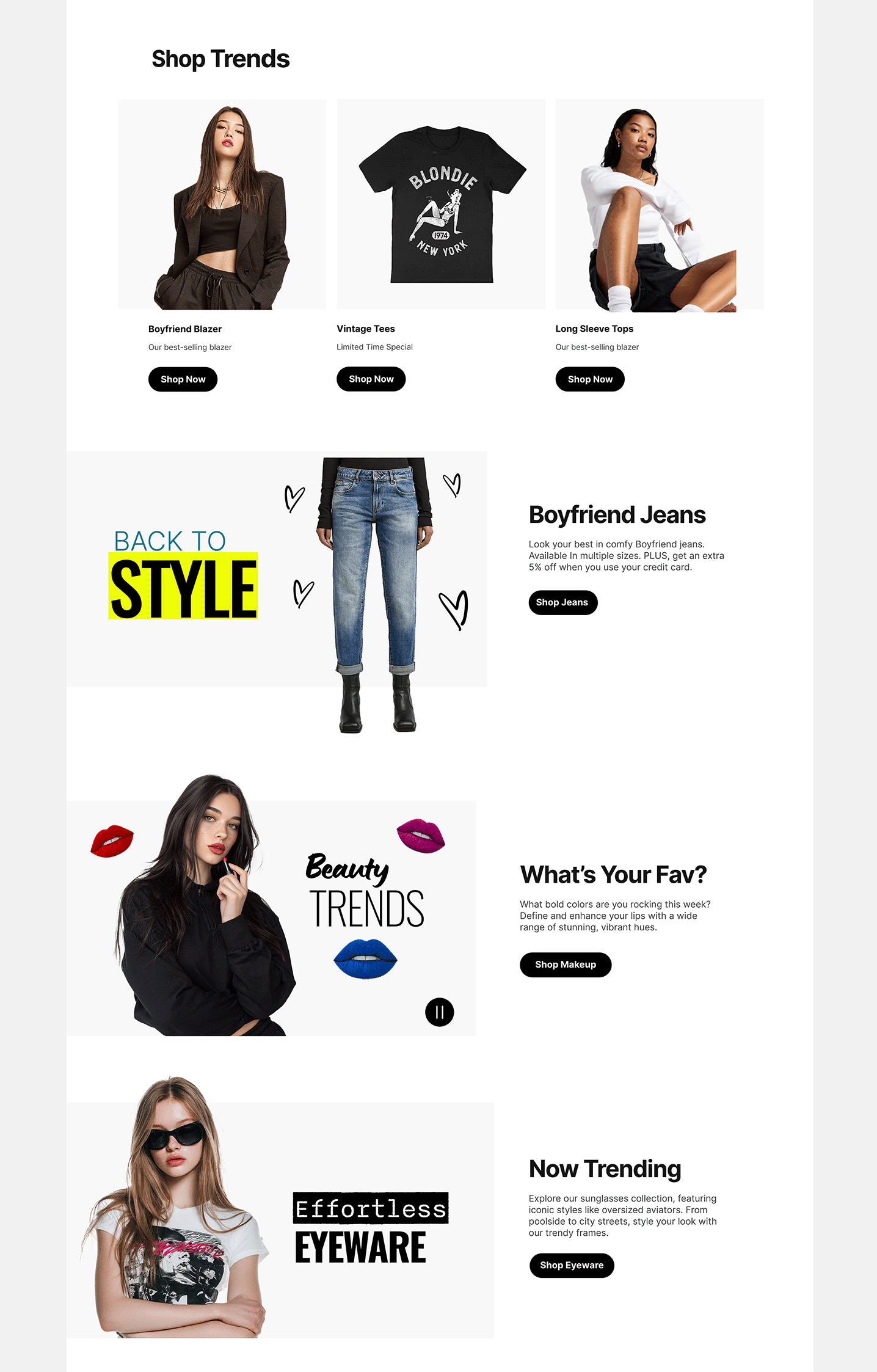
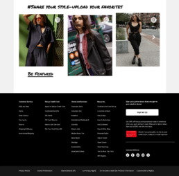
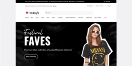
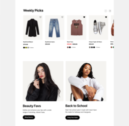
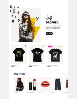
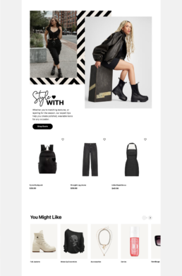
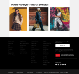
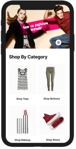
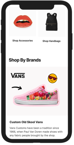
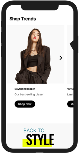
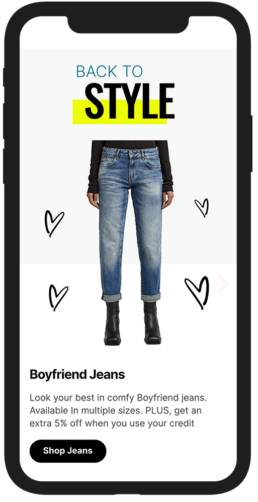
Concept Designs
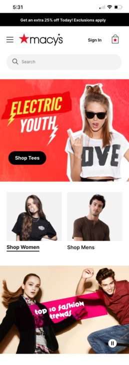
Home Page Concept 1
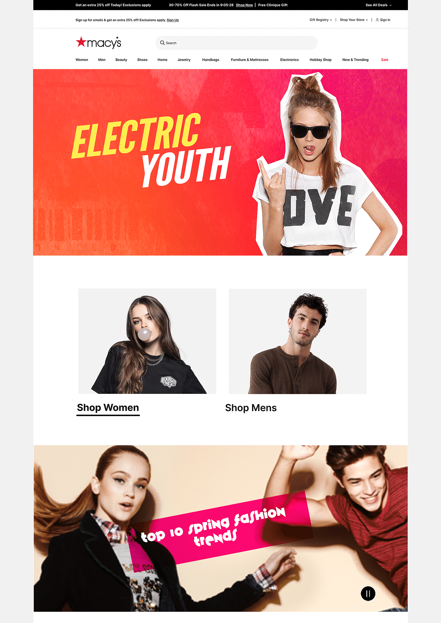
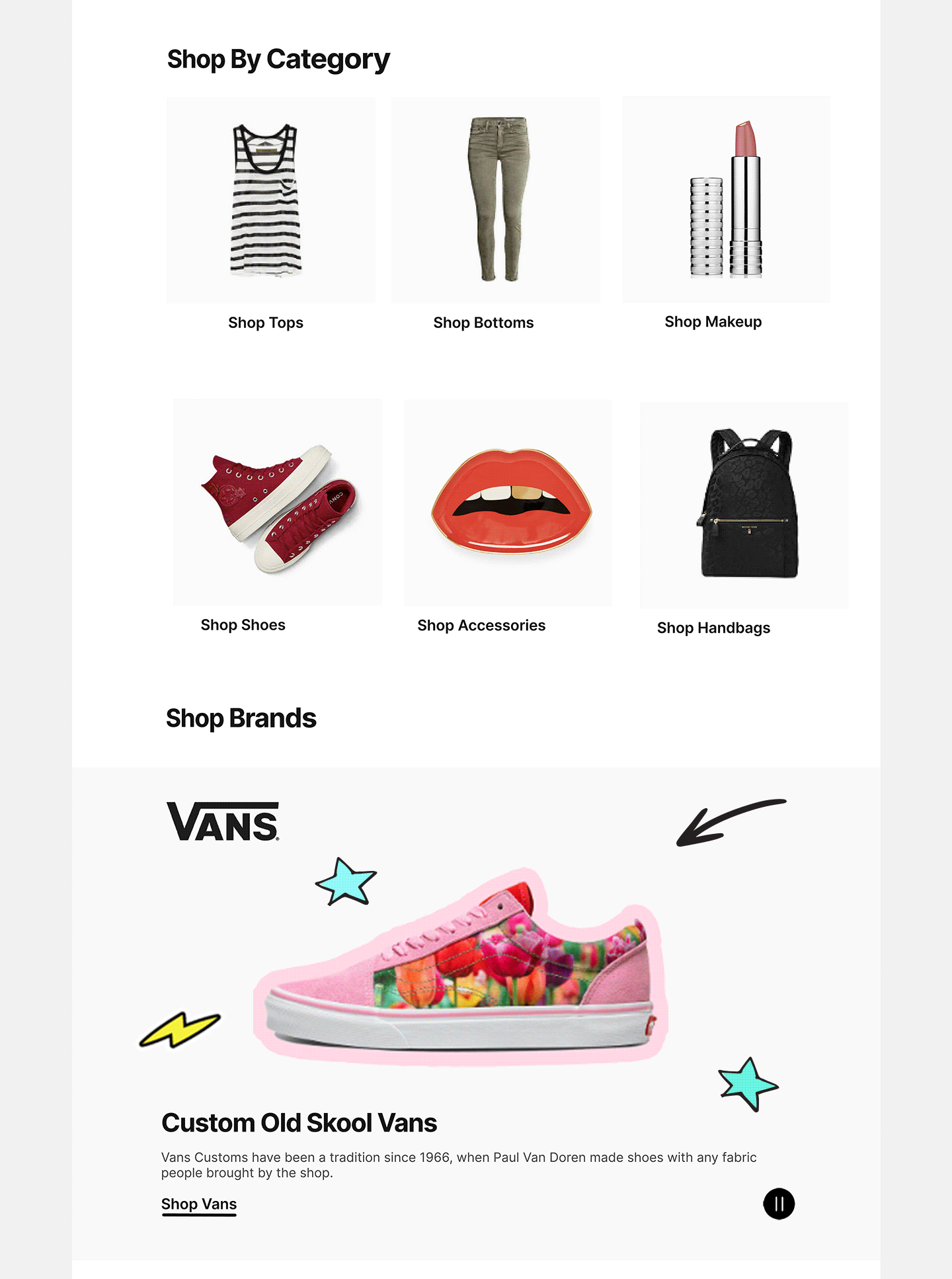
Home Page Concept 2
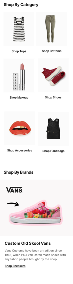
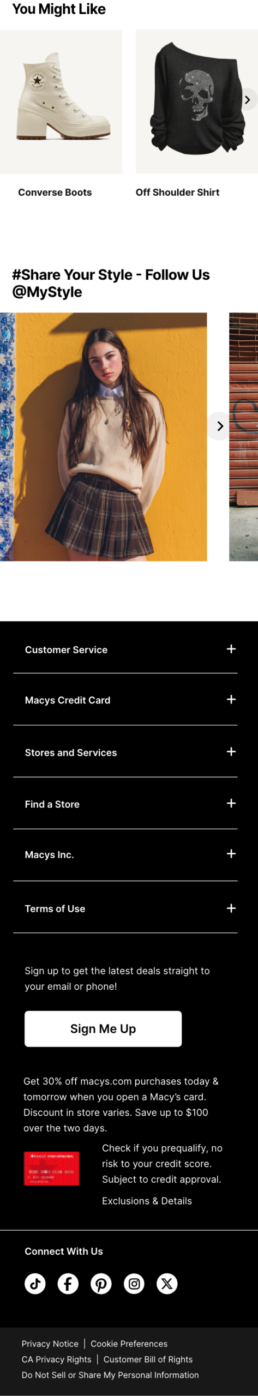
Mobile Components
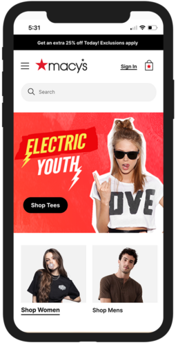
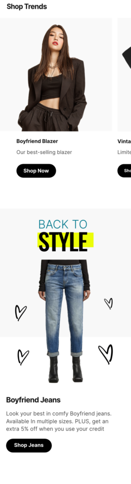
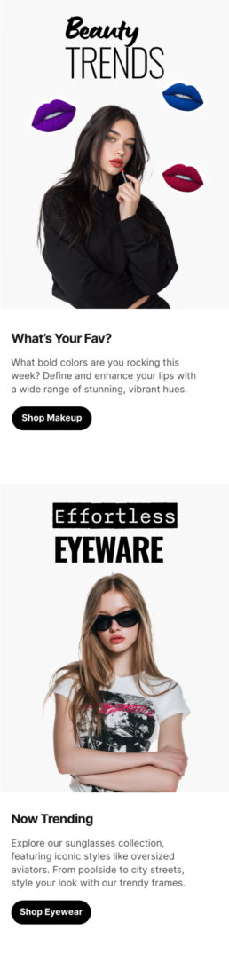
Mobile Layouts